Sunday, 27 April 2014

Question 7: Looking back at your preliminary task, what do you feel you have learnt in the progression from it to the full product?

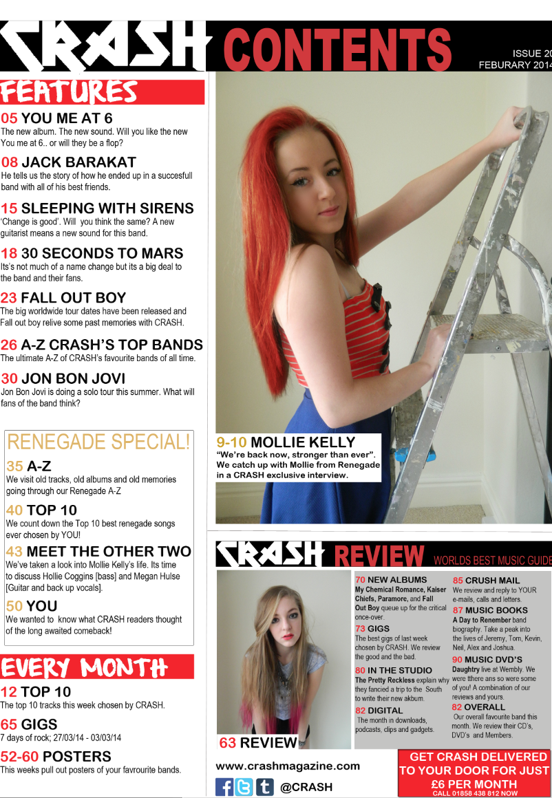
After become much more comfortable with the software I was using and researching alot of style models, My second attempt at creating a magazine was much more professional. We can see this through comparing the contents page of my Preliminary task magazine and my final music magazine. 


Here we can see that almost every aspect of my music magazine looks more professional than my preliminary task. 

Regarding my Contents page; the text is much smaller, there is more information, and the overall formation is better. These are only a few improvements that all go towards making my magazine look as professional as possible.


My front cover has greatly improved. It's quite hard to compare side to side as both magazines have different purposes, one being a rock orientated music magazine, the other being a school magazine. Even with there differences it's clear that my music magazine is much more professional.

 I have learnt how to make these professional changes by researching magazines such as 'Kerrang' and 'Rock' sound and have incorporated some of their aspects into my magazine. 


Friday, 25 April 2014

Question 6: What have you learnt about technologies from the process of constructing your product?


I used an Apple Mac to create most of my product. This was something I had never used before but I am now confident I could use it again after spending so long working on it. As for editing programs, we mainly used Adobe Photo Shop which I had had previous experience with in my preliminary task as well as other previous use, this meant I was quite familiar with the software, yet I can still say I have learnt a lot more about the program throughout creating my magazine and will be confident using Photo Shop in the future. 

Some websites I had never used before this task are Prezzi, Slideshare and the program garageband. Since some of these questions are answered with use of these three programs it's clear that i am now have some knowledge on these applications and would use them again. 

Question 5: How did you attract/address you audience?

Thursday, 17 April 2014

Question 3: What kind of media institution might distribute your media product and why?


A media institution that is likely to distribute my magazine is Bauer Media. This is because they are a large company with a lot of different media platforms and genre's of magazines. Although, I wouldn't have my magazine published by Bauer media as my magazine is quite similar to 'Kerrang' which is already distributed by Bauer Media. This would mean that my target audience would be aware of this new magazine quickly, yet as 'Kerrang' is so popular my magazine would not stand a change being in competition with it.


Another media institution I looked into was 'Hearst'. This institution again has many different platforms and reaches 1 in 4 UK adults. Yet this publisher does not have any kind of music magazines or any magazines that reach the audience that is my magazines target audience. Therefore this publisher would not be good for my magazine.


'Dennis' publishing are very proud of their different platforms and how strong they are in this area, knowing this I decided to look into this publishing company to see if they would be correct for my magazine. This company have 3 very specific headings that each of their magazines can fit into; Current affairs, Cars and Technology. My magazine does not fit into any of those categories and therefore would not fit in with this publishing company.


A publishing company that does publish Music magazines is 'Blaze' publishing. They have magazines such as 'Acoustic', 'Bass' and 'Drum'. This would be perfect for my magazine as although these are music magazines they focus on the particular instrument in the title whereas, my magazine is an all round music magazine. This way I could reach the target audience of my magazine yet my magazine would not be competing against any magazine from the same publishing company. 


Question 2: How does your media product represent particular social groups?

My particular magazine represents females more than men. This is due to my models being female and being on every piece of my magazine. They are represented in a very strong way as all the pictures show them doing very dominant, confident poses.


Here the models stance is very clearly confident, they are all making eye contact with the camera which again shows confidence and will also draw in the reader.

Although there are only females in these sections of my magazine, the audience I aimed at includes both genders.


The age range I am representing through my magazine are around 17-25 as even though my models are all 17, they look very mature and the 'characters' of the band are older.


My magazine stereotypically is aimed towards an audience of lower/middle class. My magazine represents this by showing the price of £2.20. The magazine is inexpensive enough that students that would be interested in this kind of music would be able to afford it. A higher class audience are usually made up of people older than my target audience so are unlikely to buy this magazine.

Question 1: In what ways does your media product use, develop or challenge forms and conventions of real media products?

I have ensured that my magazine follows the regular conventions of a real music magazine, yet i have also challenged some of the regular conventions to make my magazine original, especially my front cover.


Masthead


This is the masthead of my magazine. It includes the name of my magazine which is 'CRASH' and includes the two main colours in my colour scheme; Black and Red. My masthead covers the entire top of my magazines front cover as all usual mastheads do.

Sell Lines


I have stuck to the regular conventions of a music magazine by having sell lines to attract the audience. This includes having taglines such as 'Free' to catch the audience's eye. Usually, these sell lines are at the top of a front cover, yet I have put mine at the bottom to develop the usual conventions and to ensure my magazine looks as  professional as possible.

Bar code & Price


I also have a bar code and a price on the cover of my magazine which, again, is a convention of a real media product.

Headline & Sub headline


Another convention of a magazine is having a main headline and a sub headline. I have done this here by using the name of the band on the front cover to be my main headline and draw attention to them and then also using 'our big comeback' in smaller font so that it's obvious what the main article inside will be about.

Page Numbers


Another regular convention of music magazines are page numbers. These numbers relate back to my contents page to ensure it's easier for the readers to find the information they want. These specific numbers are from my double page spread.

Mise en scene

My entire magazine connects together through the use of mise en scene. I have used specific colours; Black, red and white, throughout my magazine. These colours are all conventional colours of a music magazine and the main colour, red, connotes power which links to the pose on the front of the magazine. Also the red links in with the hair colour of the lead singer of the 'band' on the front cover. I have also used the same fonts throughout my magazine to ensure each page links in and the magazine looks professional.

Costume, Props & People

I have ensured the costume my models are wearing relates to music and catches the eye of the audience. The red hair I have applied onto the 'lead singer' through photo shop adds to the costume and links it in to the colour scheme of the rest of the magazine. I have not used any props as I believe the stance and the expressions on the girls already prove that this is a music magazine and follow the conventions.

Font size and Style

The font and size of my front cover heading 'CRASH' is done in a way that is regular to magazine conventions. It is a large size and very bold as it is a solid black. The style of this font can relate to a music magazine as it looks almost broken and sharp which reminds me of rock music. A large portion of the rest of the text on my front cover is in a font called 'From where you are' which may be challenging regular conventions as it is not a usual font. I chose this particular font because I believe it fits well with my magazine and gives it a unique look, yet still manages to look professional. 

The article text within my double page spread is quite small to fit in as much information as possible and as when I looked at my style models the font was also very small. This body of text is also just a regular font that relates to the usual font on my front cover. Another font that does this is 'From where you are' as I have used this font again for the heading of my double page spread to stay with the house style.

The contents page also follows the rules of my house style as I have used 'From where you are' as the headings and the other fonts are just an average font to ensure the audience are able to easily read and understand the text.

Content

The content within my double page spread is an interview with the feature band of my magazine, Renegade. It is a common interview talking about upcoming tours, albums and other artists. This is a very regular convention of a music magazine. 

Questions

1. In what ways does your media product use, develop or challenge forms and conventions of real media products?

2. How does your media product represent particular social groups?

3. What kind of media institution might distribute your media product and why?

4. Who would be the audience for your media product?

5. How did you attract/address your audience?

6. What have you learnt about technologies from the process of constructing this product?

7. Looking back at your preliminary task, what do you feel you have learnt in the progression from it to the full product?